Monday, April 12, 2010
More processes I have become fascinated with
The Casein Printing method. This process yields very raw, earthy and vintage looking images. After looking at Donald E. Camp's work, I have become very interested in this process and would like to attempt it. By using curdled milk, simple acids and pigment, you can take a negative and expose the pigment which has become photo sensitive. The pigment can also be a wide variety from oil to dirt like Camp's work. Not only that, multiple pigments can be done in multiple layers to create images that almost look like charcoal and pastel drawings.
This process doesn't seem to be too difficult, but requires some skill and finesse to get the hang of it. It also interests me because you don't need chemicals or a serious light room or setup for that matter. Also, as a result of the process, depending on the subject matter, the technique can add a grit and gravity to the image. This process is very interesting and I plan on attempting it in the near future.
HDR photography and my new desire
After just browsing images and photo websites one day, I came upon HDR or High Dynamic Ranging photography, and these shots just blew me away. They are outrageously colorful and lush and just so unbelievably vivid. I only assumed these were all heavily shopped images, but as it turns out, its done by making composites out of bracketed images that are underexposed, correct and overblown. This concept and the results are just so mindblowing I cant get over them.
Unfortunately, im sure the software to do this is outlandishly priced, and requires a buttload of processing power from what some websites have said, but I will try this technique. Since I am more of a painter than anything else, I love color and the luminoscity of this process and I cannot help but try to get this software and do it myself.
One thing about this process though is that some images come out like total shit. Some people seem to push everything way to far colorwise and everything looks really bad and cartoony and over the top. When done correctly, to me the images have a really great balance between real and surreal.
Monday, March 29, 2010
Christine Shank
Shank is another miniature set photographer. Her work is more visibly made using miniatures, but the images are more complex than the previous artist. The series im looking at is her interior series which, once again relies on light to get the sense of atmosphere and space in the rooms. Her interiors are furnished with doll house items and have more of a narrative sense behind them.
My favorite image is "You Promised to Listen" which uses the light to cascade into a window. However, there is an effect of dust being caught by the light which is reminiscent of the setting sun flooding into an open room at just the right angle to catch every little speck floating around.
After looking at a few miniature model photographers, I wish I could have at least tried to work in miniature for one of my projects. I enjoy the concept of being able to control every aspect of the environment, which I think would be a very helpful way to get results for a project, whereas my previous two failed attempts for a project were direct results of not being able to work, control and light the environment. Although I wont be doing any miniatures for my projects, I can see myself attempting to work in miniature for fun on my own in the future.
James Casebere
Already on the grounds of miniatures, James Casebere makes extremely realistic architectural miniatures. Whats more amazing is that these pieces are interiors, which would generally make miniatures become visible as such. However with his interiors, its easy to just assume they are photos of actual locations. The walls look like actual stucco walls, aged and dry, with sunlight pouring in from the small windows. In one image, a pile of rubble sits in the middle and just enforces the realism of the image.
In addition to these miniature interiors, he also floods some, making them reminiscent of an old venetian building that has become flooded. The rooms become even smaller and a sense of urgency is felt, as if you are trapped in this flooding room.
The lighting is used to make these spaces feel realistic, and create a sense of depth and atmosphere inside, which really does seem real.
Matthew Albanese's tiny worlds
Straying away from horror now and going into the way lights can create atmospheres, Matthew Albanese builds meticulous sets out of household items to create landscapes that feel nothing short of immense. The lighting is crucial in his projects, as they are what turns large piles of paprika and cinnamon into martian landscapes, or tiny twigs an paper into a forest set just outside a mountain.
His work really goes to show just how creative and physically in control of the environment a photographer can be. Granted these sets take several months to build sometimes, and require many labor intensive hours of tedious finely detailed work, but the results are unbelievable. Albanese uses steel wool and moss, and turns it into a terrifying tornado ripping through a plain. Alternately, he can take a glass patio table and create a serene lake vista complete with waterfall.
Everything with these photos comes down to lighting to get the materials to take on the desired effects. often using all types of different sources and different types of lighting setups does he create such amazing works.
The Eerie kids of Zhang Peng
Zhang Peng has his own motives behind his works, including social commentaries, however they are of interest to me because of the horror/creep aspect of the images. They depict small Asian children in "adult" situations like bloodied wedding gowns, pools of blood etc. The main draw to these photographs for me is the juxtaposition of these extremely small, almost irregular, sized children with blank faces in these serious, bloody, and horrific scenes.
These images are also so beautifully and softly lit, making the children look like porcelain dolls with vivid colors of fabric and blood all around them. To me, once again, I want to be able to emulate the style of surreal horror and creepiness. I am a big fan of blood and gore and things along those lines, so these images really make me want to work in similar terms.
Joshua Hoffine and his horror photographs
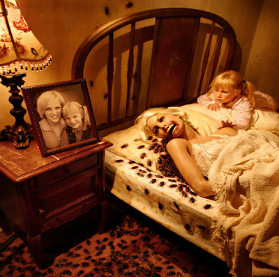
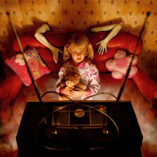
As my first post in regards to lighting and technique, Im looking at Joshua Hoffine and his horror images. Since I wanted to do horror portraits as my own portfolio set, his work is of interest to me. The main thing about his images that are relevant is his scenarios he creates with props and use of studio lighting to illuminate the scene. These images capture my attention due to their dark appearance and very detailed setups. Hoffine also uses children in alot of his images to give off that sense of innocence, and wonderment in a dark and cruel world that is out to get them.
I hope to relate to his work in a much simpler context, as I will be doing portraits instead of large settings. However, I want to be able to establish a mood with the lights and gel filters that Hoffine has in many of his images. Not only that, but even with his dark toned images, the colors are vibrant and that is another factor I want to emulate.
Subscribe to:
Posts (Atom)